
Bringing a Shared Market Perspective to Private Credit
Helping analysts contribute, compare, and maintain financial estimates in Octus Fundamentals.

- TIMELINE
- July – September 2026
- ROLE
- Product Designer
- SKILLS
- Figma & Claude Code
OVERVIEW
Make participation straightforward while directing attention to the decisions that matter.
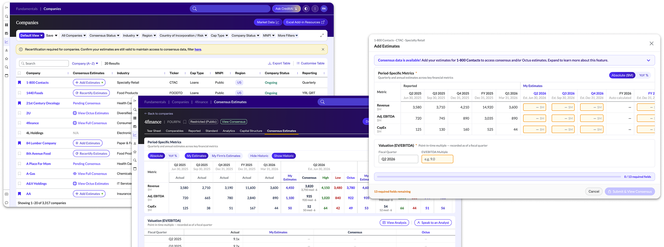
In public equities, consensus estimates give analysts a shared reference point for market expectations. In private credit, that picture was harder to assemble — analysts often relied on calls to peers at other firms to understand how their forecasts compared.
Octus’ Fundamentals Consensus Estimates simplifies that process. Clients contribute forward-looking estimates for a company and, in return, unlock an aggregated, anonymized peer consensus alongside Octus’s own estimates.
I owned the end-to-end UX and UI, turning the business concept into user flows, building interactive prototypes, and handoff to developers, working with product, engineering, design, and editorial along the way.
THE OPPORTUNITY
A shared benchmark needed participation
Private credit analysts often relied on conversations with peers to understand market expectations. Octus saw an opportunity to bring those expectations into Fundamentals, where clients already worked with historical financial data.
The business team proposed give-to-get model: contribute estimates for a company to unlock the available peer and Octus data. But the value was not always immediate. An analyst could contribute before enough other firms had submitted to produce consensus. It was important to:
How might we make the value clear and the next action understandable — even when users have to wait.
DEFINING THE EXPERIENCE
Resolving the requirements through design
The concept was established, but its practical behavior needed definition. I worked with product and engineering to resolve questions such as:
- Before contribution: What can users see and unlock?
- After submission: What happens while calculations run or contributions are insufficient?
- When review is required: What must users confirm, and can they retain their original estimates?
I maintained the BDD with product and created separate design documentation covering interaction states and behaviors for developers. The flows helped us expose gaps in the requirements and agree on how the product should behave.
DESIGN DECISION 01
Make required actions stand out
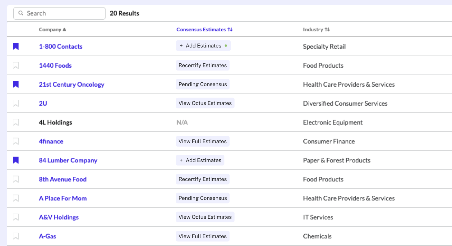
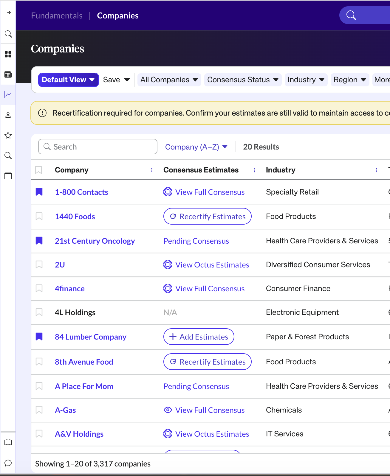
A company could need estimates, be waiting for contributions, or have data ready to view. I used different button variants and contextual banners to communicate the state and explain what users could do next.
What the walkthrough revealed
The initial buttons looked too similar. An internal reviewer struggled to distinguish rows requiring action from rows where they could simply view data.
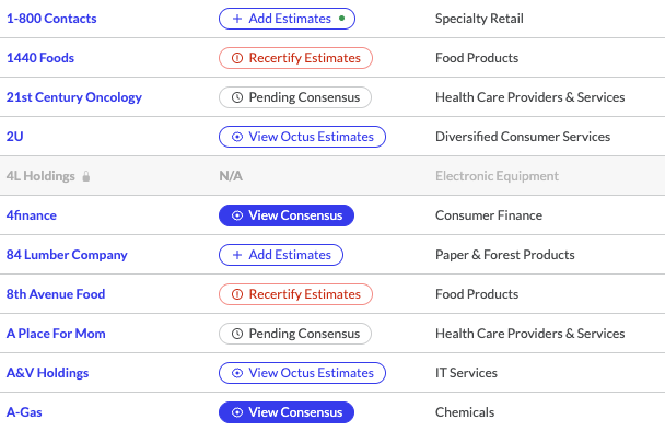
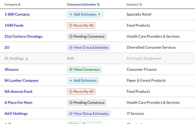
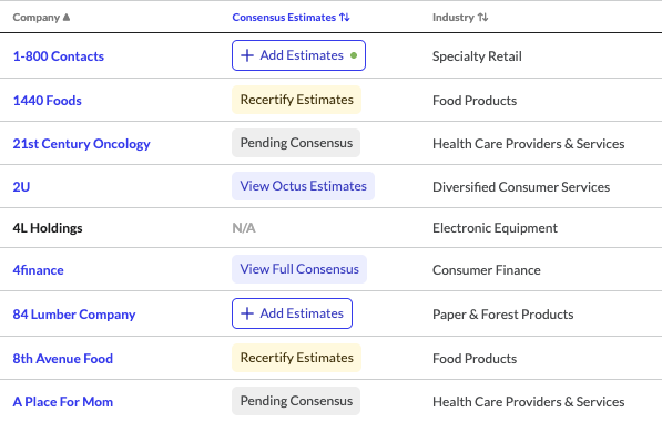
What I changed
- Changed view-only actions to text buttons.
- Gave “Add Estimates” and “Recertify Estimates” greater visual emphasis.
- Used contextual explanations to connect each action with the value or access it enabled.
DESIGN DECISION 02
Make recertification a deliberate review
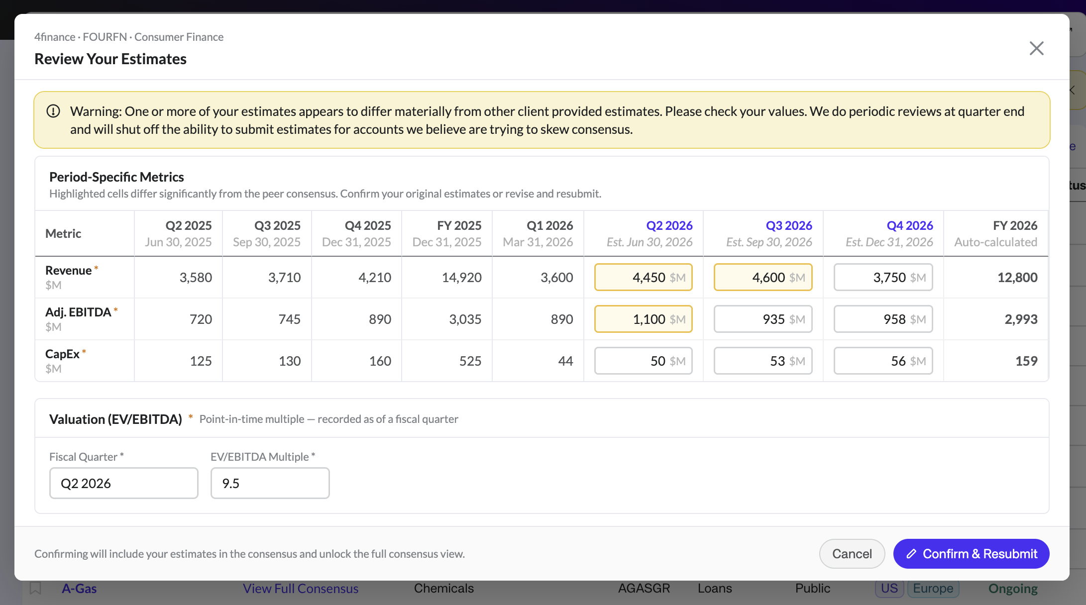
At each reporting-period end, users needed to review their remaining estimates and confirm or update them to maintain access. The early walkthrough showed that the values were easy to overlook: our first round of user testing showed that users treated recertification as a step to glaze over before reaching consensus.
How might we give the recertification step the attention it deserves?
I added yellow warning states around fields requiring review and kept the action contained in a modal to purposely add friction to the workflow, directing attention to the existing estimates and signaling to the user that this was a required step. In a follow-up walkthrough with a different editorial colleague, I observed them checking those values before submitting.
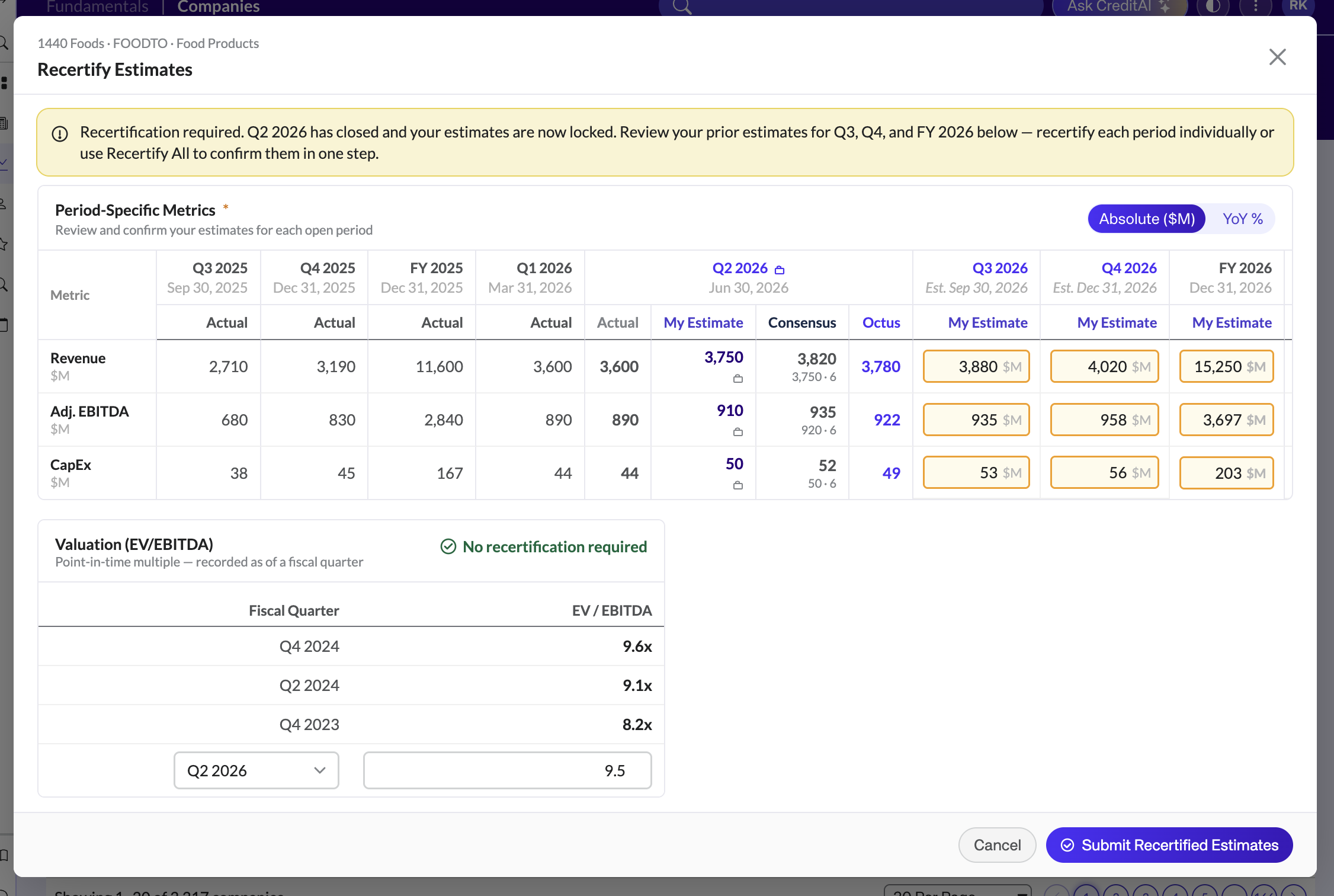
Highlighted fields direct attention to existing forecasts before users confirm or update them.
DESIGN DECISION 03
Explain warnings while preserving judgment
An unusual estimate (we define as outside three standard deviations from the consensus) could reflect a mistake—or an intentional difference in outlook. Internal feedback showed that a general warning was insufficient. Users needed to understand:
- Which values were flagged.
- Why those values needed attention.
- How to continue, including keeping their estimates unchanged.
I paired field-level highlights with an explanatory banner and actions to confirm or revise.
Adapting to calculation time
I initially explored interactions for immediate feedback for outliers during entry. However, when validating functionality, Engineering needed approximately 10–15 seconds to run the calculation, so I worked with product and engineering to introduce a pending state after submission.
The flow also had to handle delayed consensus: estimates submitted before peer data existed could require review once consensus became available.
The full-consensus path. While peer consensus is unavailable, users can remain pending or view Octus estimates if available.
Why keep “View Full Consensus”?
Internal testing showed that users gravitated toward the “View Full Consensus” button more readily than a review-focused button (i.e. “Certify Estimates”). We kept the available value visible and explained the review requirement inside the tab, where users could act on it.
The trade-off: the label stayed simple, but some users encountered an additional step before access.
EVALUATION
Learning through internal walkthroughs
With limited time and access to clients, I conducted usability tests and user testing with internal editorial colleagues familiar with buy-side workflows.
Different colleagues helped surface confusion without relying on familiarity with previous versions. Their feedback informed the action hierarchy, recertification highlights, and outlier explanations.
These sessions supported our interaction decisions, but only launch would reveal how clients interpreted the experience in practice.
LAUNCH OUTCOMES
Building multi-firm participation
The feature launched on September 10, 2026. Updated reporting showed:
≈61%
Of accounts with access have submitted at least once
≈74%
Of companies with estimates had contributions from two or more firms
Updated usage reporting showed participation across firms — the foundation of the shared benchmark.
These figures establish product participation.
AFTER LAUNCH
Client feedback prompted another refinement
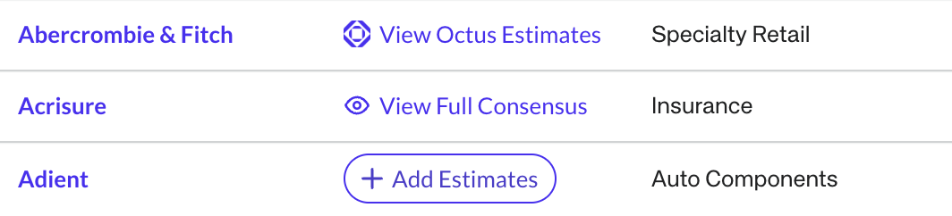
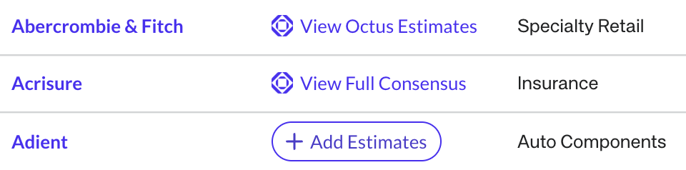
After launch, clients reported that they could not tell whether Octus estimates were available for companies who had a full consensus available before clicking. The button label communicated that a full consensus existed, but left an important availability question unanswered.
We proposed replacing the eye icon with the Octus logo when Octus estimates were available with the full consensus, adding that distinction without introducing another label
The indicator is currently in QA.
LEARNINGS
Completion isn’t comprehension
Seeing someone submit without reviewing their estimates taught me to look beyond whether they could finish a task to whether the design prompted the intended decision.
Use internal expertise while recognizing its limits
Editorial colleagues helped me uncover confusion quickly. Next time, I’d involve clients earlier to understand how the experience fits their actual research habits.
This project strengthened my ability to translate complex business rules into an experience that helps analysts understand their options and make deliberate decisions, and increased my understanding on buyside workflows that I will carry into projects to come!