
Reimagining Saved Views in Dashboards
Redesigning Saved Views in Dashboards to help users understand shared configurations and update them without losing sight of their data.

- TIMELINE
- June - August 2024
- ROLE
- Product Design Intern
- SKILLS
- Figma, Datadog, UX Research

OVERVIEW
Saved Views lets Datadog users save and share frequently used sets of template variable values. These variables determine the scope of data displayed in dashboard widgets.
I led the design explorations, final screens, prototype, and engineering handoff, and worked with a UX researcher on surveys and interviews.
PROBLEM
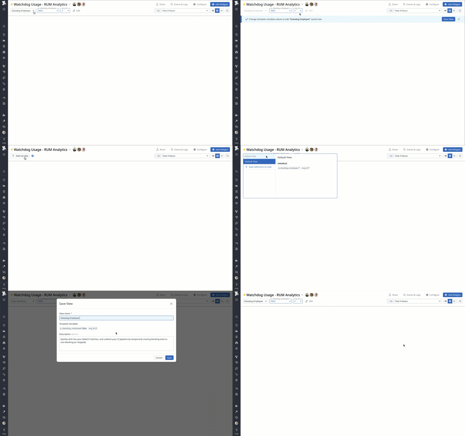
A shortcut that was difficult to update
Saved Views had not been updated since its launch in 2019. Customers and internal users had raised usability issues, and addressing them became part of the Dashboards team’s quarterly priorities.
Three problems shaped my project:
- Updating required replacing: Users had to change variable values, save a new view, and delete the old one.
- Shared saved views lacked context: A name alone did not explain what someone else’s configuration was for.
- Modified values were poorly distinguished: The dropdown did not clearly communicate when current values no longer matched a Saved View.
RESEARCH
Understanding use through research and observation
I worked with a UX researcher on a survey completed by six internal users and four external customers, followed by four interviews with respondents.
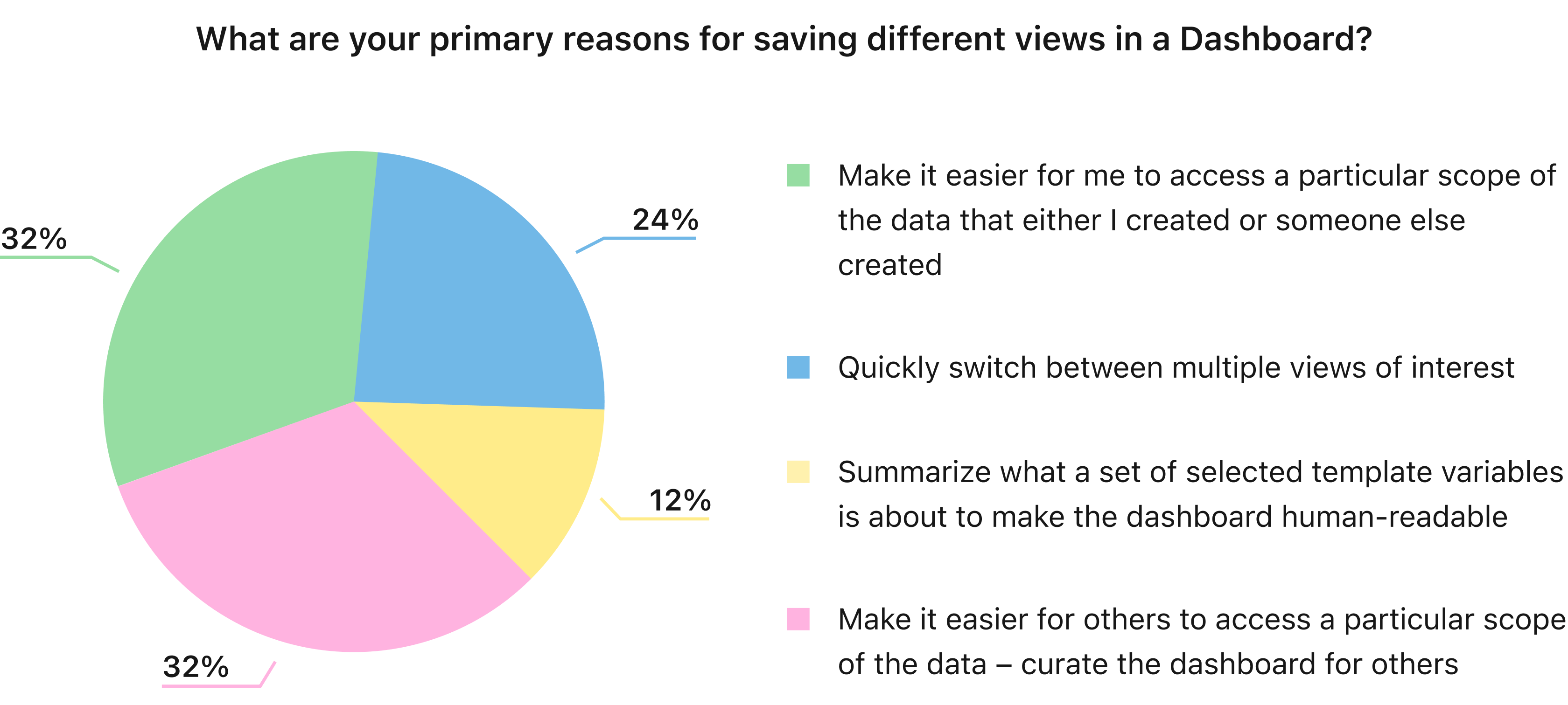
Through the survey, we gathered that users used Saved Views to return to a particular scope of data, switch between configurations, make the dashboard more human-readable, and give coworkers access to the same datasets. The feature supported both individual exploration and shared workflows.
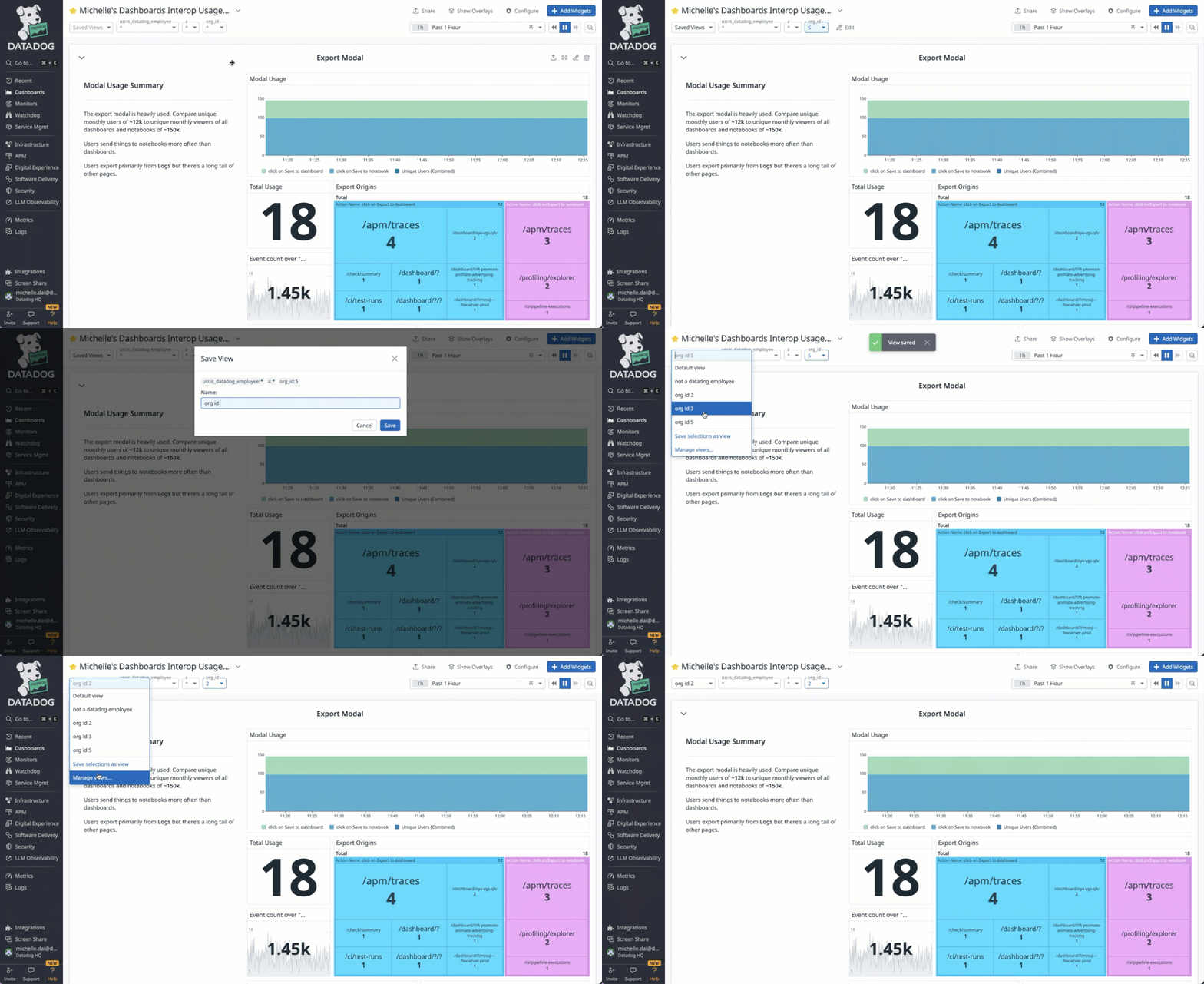
I also reviewed usage recordings through Datadog’s Real User Monitoring platform. I observed users trying the header’s Edit action, which changed which variables appeared rather than editing a Saved View’s values. This helped me identify ambiguity between configuring dashboard variables and updating a saved configuration.
Learning from comparable features
Exploration of comparable features added another perspective. A designer working on a similar feature in Datadog APM shared that descriptions were important because recipients of shared views lacked the creator’s context. I judged that insight relevant to Dashboards, where views were also shareable.
SCOPE
Choosing a focused V1
My PM and I prioritized core usability issues we could address within my internship. Larger opportunities — including permissions and smart auto-generated views — were left for later.
We focused on three connected decisions: clarifying the current state, providing context for selection, and enabling intentional edits.
How might we enable users to explore variable values freely, while understanding and deliberately updating a saved configuration?
DESIGN DECISION 01
Distinguishing exploration from a Saved View
Before adding editing, I needed to clarify what the interface communicated about the current state.
I identified three states:
| Design | State | Meaning |
|---|---|---|
 | Default | No Saved View is active. |
 My view 24 | Saved View Selected | Current variable values match the saved configuration. |
| Saved View Modified | Variable values have changed since a Saved View was selected. |
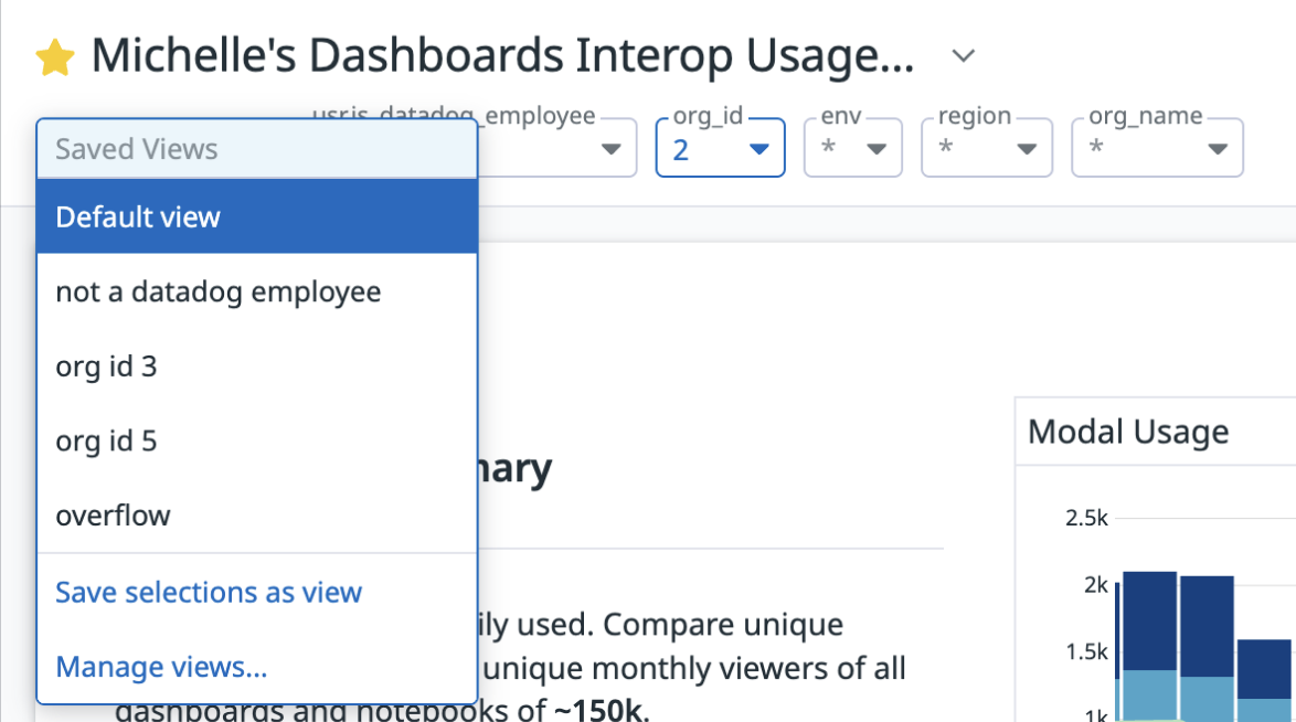 | Saved View Modified | Dropdown shows user is no longer in the same saved view. |
The modified state was poorly represented. After a value changed, the dropdown displayed a generic Saved Views label in the same font and color as a selected view.
These changes were temporary: the original Saved View stayed unchanged. Switching views discarded the temporary changes and applied the newly selected view’s values.
I explored a prominent change indicator, an italicized view name in a secondary text color, and a “No view selected” label.
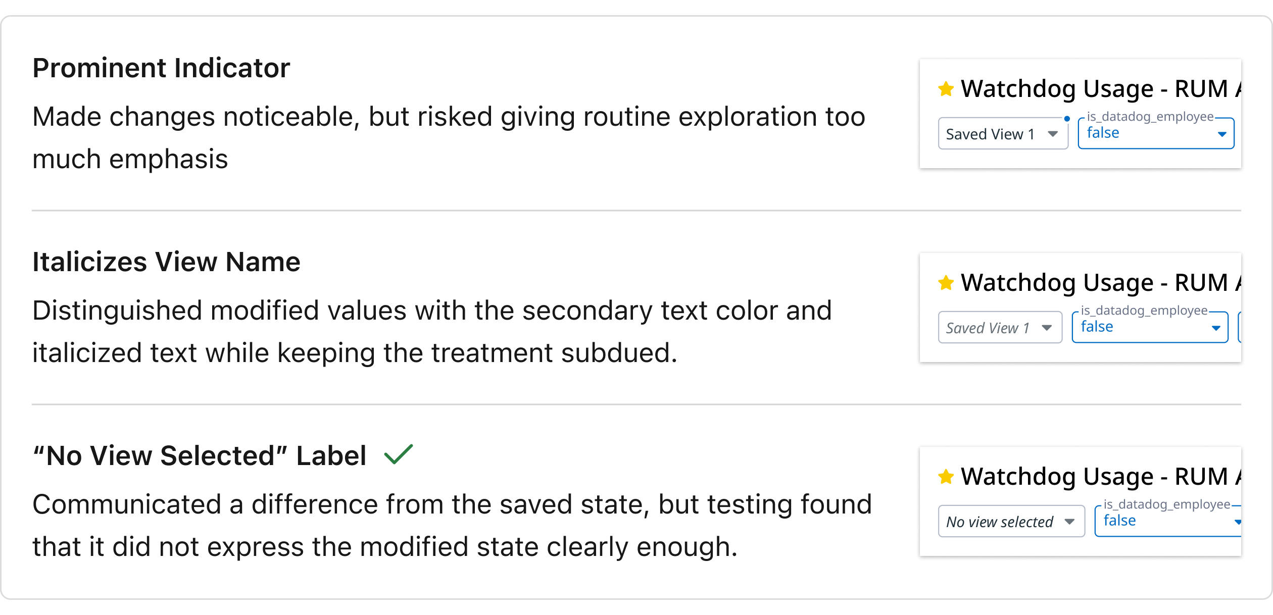
Through brainstorming and reviews with my team, I chose the italicized view name in a secondary text color.
DESIGN DECISION 02
Showing context beside the dashboard
State feedback addressed the current configuration, but users also needed to understand the views they could select.
The existing dropdown showed names alone. Inspecting associated variables and values required opening Manage Views, and shared views had little room to explain their intended use.
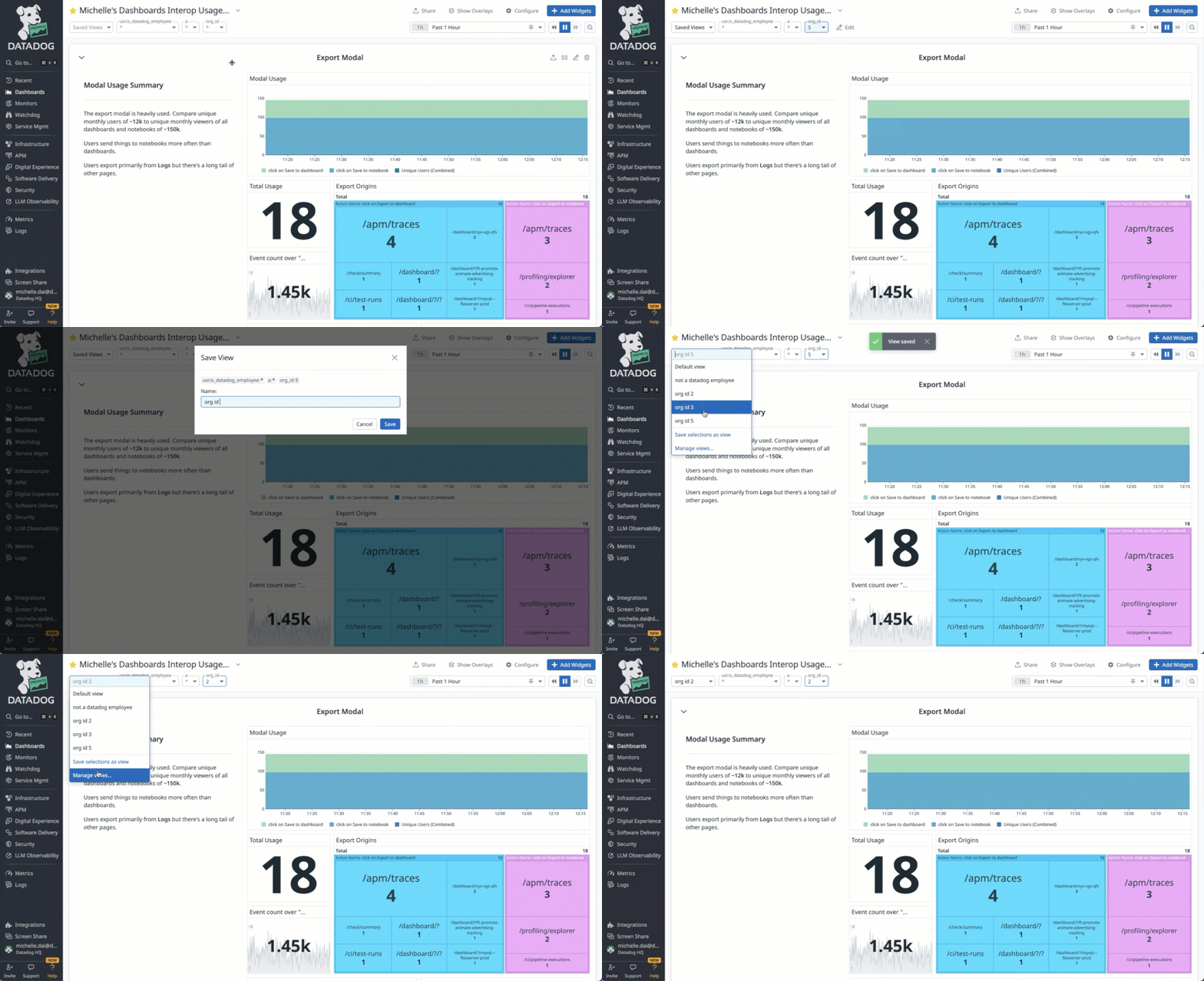
I explored ways to bring descriptions and variable values closer to selection, drawing on patterns from Datadog Logs, Monitors, and Notebooks.
| Direction | Trade-off |
|---|---|
| Manage Views modal | Familiar, but required an extra step and obscured the dashboard. |
| Larger management panel | Provided room for details and actions, but reduced visibility of widgets and variables. |
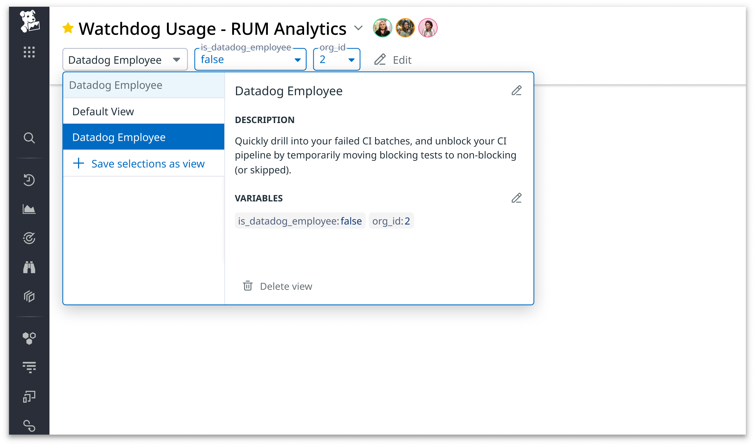
Adjacent Preview  | Kept details beside selection while preserving dashboard visibility. |
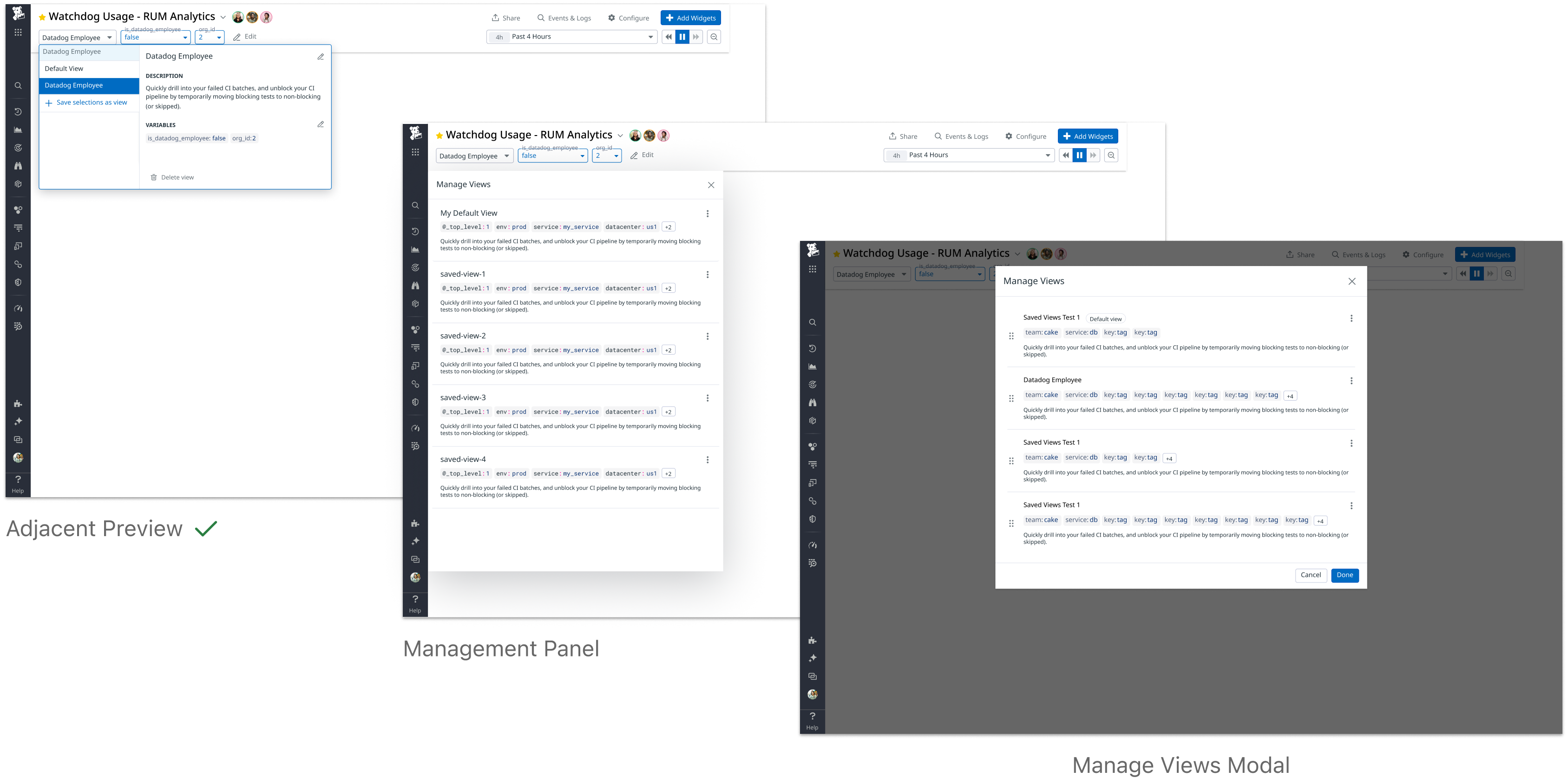
My team and I decided on the adjacent preview. While choosing a view, users needed to see dashboard widgets and the variables at the top of the page. The preview preserved that context without giving Saved Views more prominence than the dashboard itself.
It also provided a place for descriptions, allowing creators to explain a view’s intended use to other users when shared.
DESIGN DECISION 03
Making intentional editing clear
With context available beside selection, the next challenge was enabling users to update a view. The editing interaction needed to distinguish exploring variable values from saving changes to an existing configuration.
I separated variable editing from name and description editing. Usage recordings and context from the previous designer indicated that variable values were updated more frequently. Variable editing also required visibility into the dashboard as values changed, while names and descriptions could be edited within the preview.
Making variable-editing mode explicit
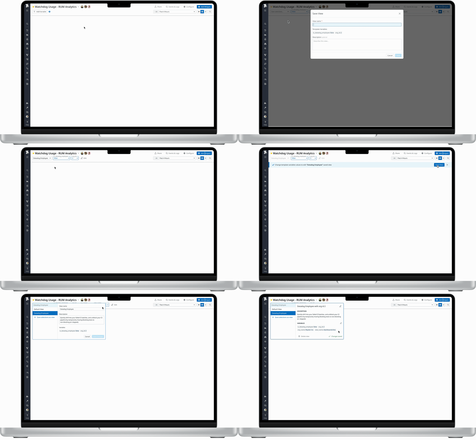
One exploration placed Save changes and Cancel beside the template variables. Internal users raised ambiguity about whether those controls updated the Saved View or configured the dashboard’s variables . More actions also made the header too dynamic.
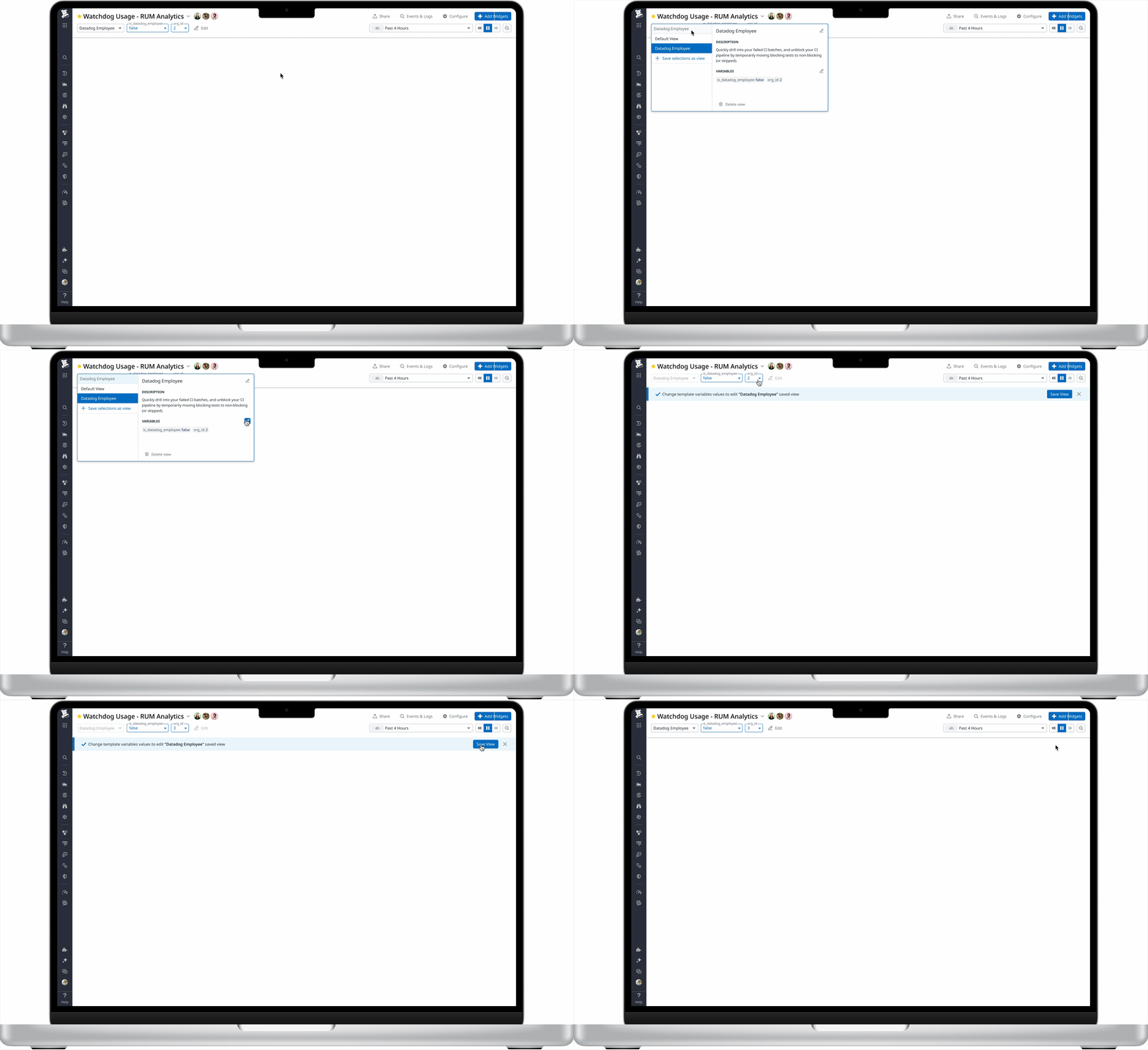
I explored a more explicit editing state, and decided on a blue banner below the header that named the Saved View being edited and instructed users to change its template variable values.
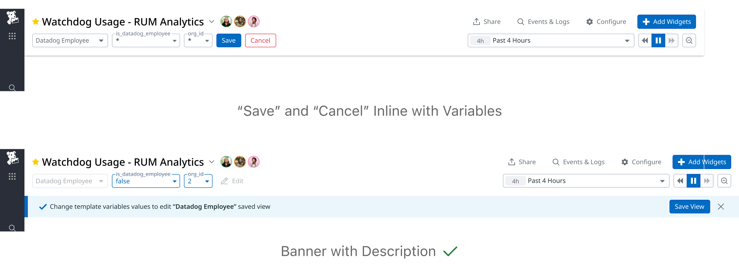
In this mode, users could change existing values but could not add variables, since that was controlled by an existing different button.
- Save updated the existing Saved View with the new values.
- Cancel discarded the edits and restored the original values.
Users could continue seeing live changes in dashboard widgets . The banner and restricted editing scope were intended to distinguish this mode from ordinary exploration and the header’s separate Edit action.
Editing names and descriptions in place
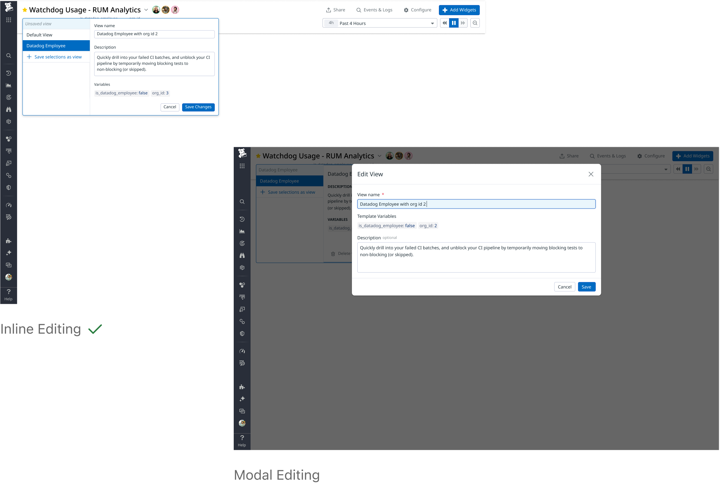
For names and descriptions, I compared a modal with editing inside the adjacent preview.
The modal interrupted the flow and obscured the dashboard. I selected editing within the preview to keep changes close to the information users were already inspecting.
SOLUTION
Connecting selection, exploration, and editing
The final design connected three activities:
- Understand and select: Inspect a view’s description and variables beside the dropdown.
- Explore: Change variable values temporarily, with a distinct modified-state treatment.
- Update deliberately: Enter editing mode to save changes to the existing view.
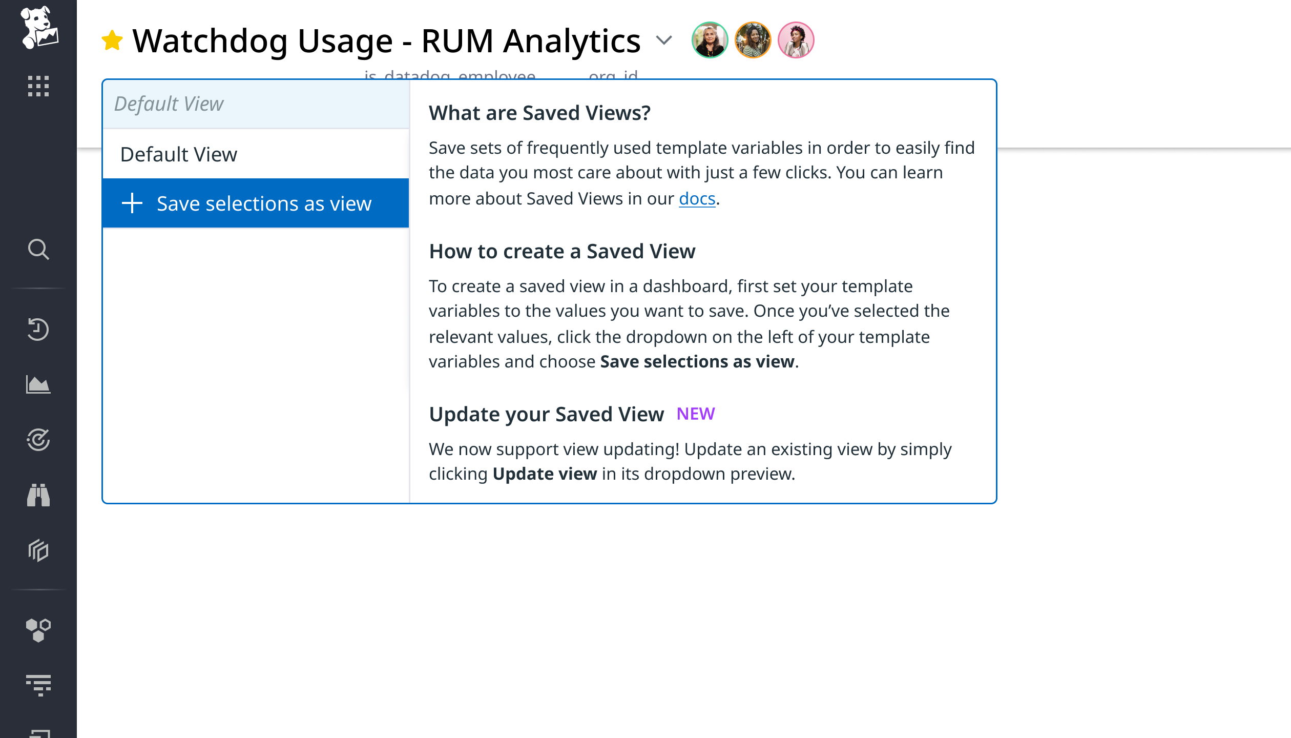
I added contextual onboarding to the preview for Save selections as view, explaining how to create and edit a Saved View and linking to Datadog’s documentation.
OUTCOME
A completed handoff, with validation still ahead
By the end of my internship, I handed engineering the final screens, interactive prototype, and annotations covering interaction states and Save/Cancel behavior. The handoff defined a focused V1 addressing the team’s usability priorities.
REFLECTION
Evaluating patterns in context
I learned to weigh feedback and existing patterns against the context of use.
Patterns elsewhere in Datadog helped me explore possibilities, but they did not automatically fit Saved Views. A modal or larger panel offered space for management tasks while taking away dashboard context.
Working through that trade-off with my team helped me become more deliberate: understand the concern behind feedback, then evaluate the response against what users need to see and do.